How do you stop a big, white modern extension from feeling too clinical? You trade perfection for character. The challenge was to integrate a pristine new kitchen into a home full of history, ensuring the two felt connected rather than colliding.
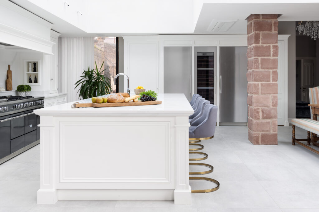
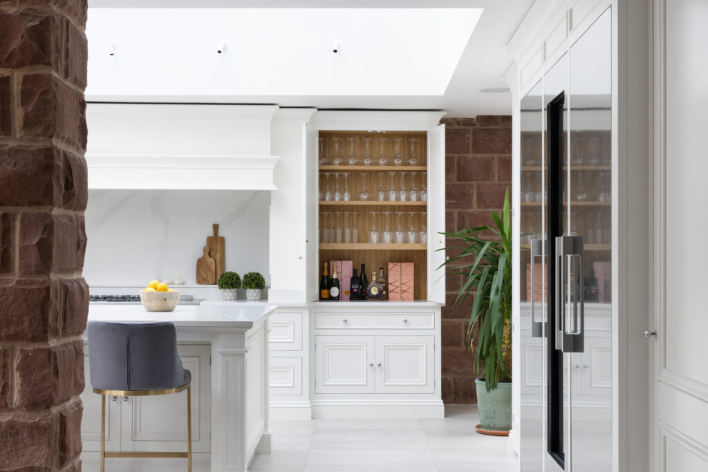
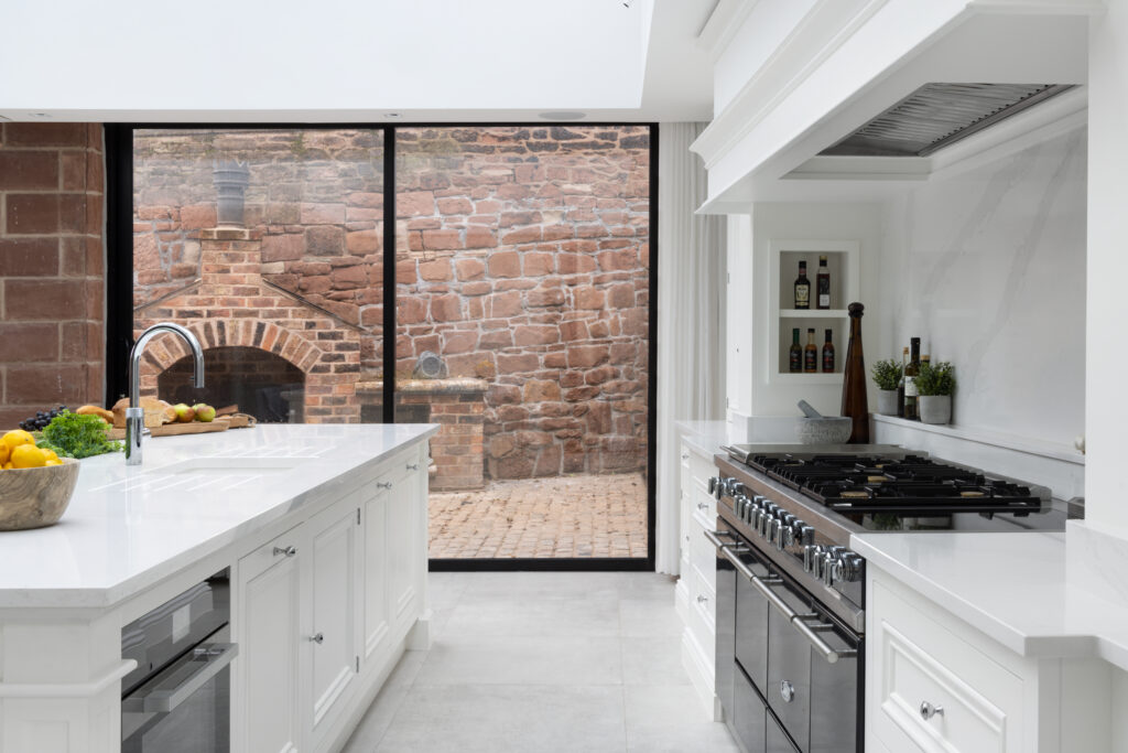
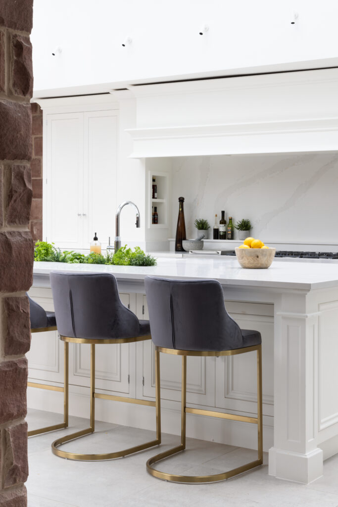
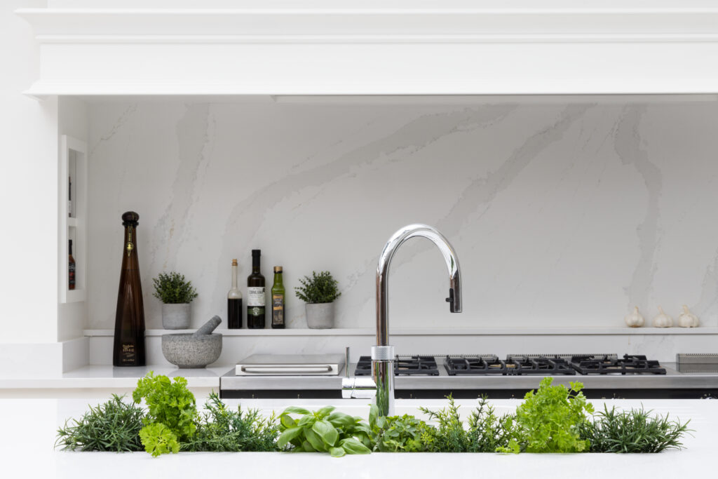
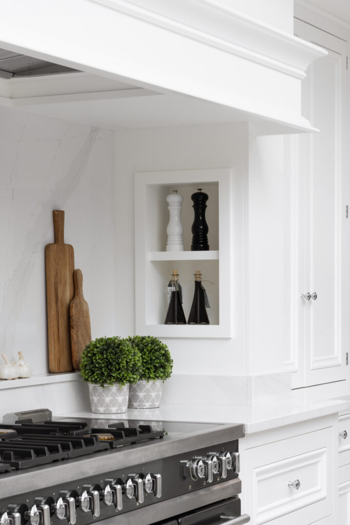
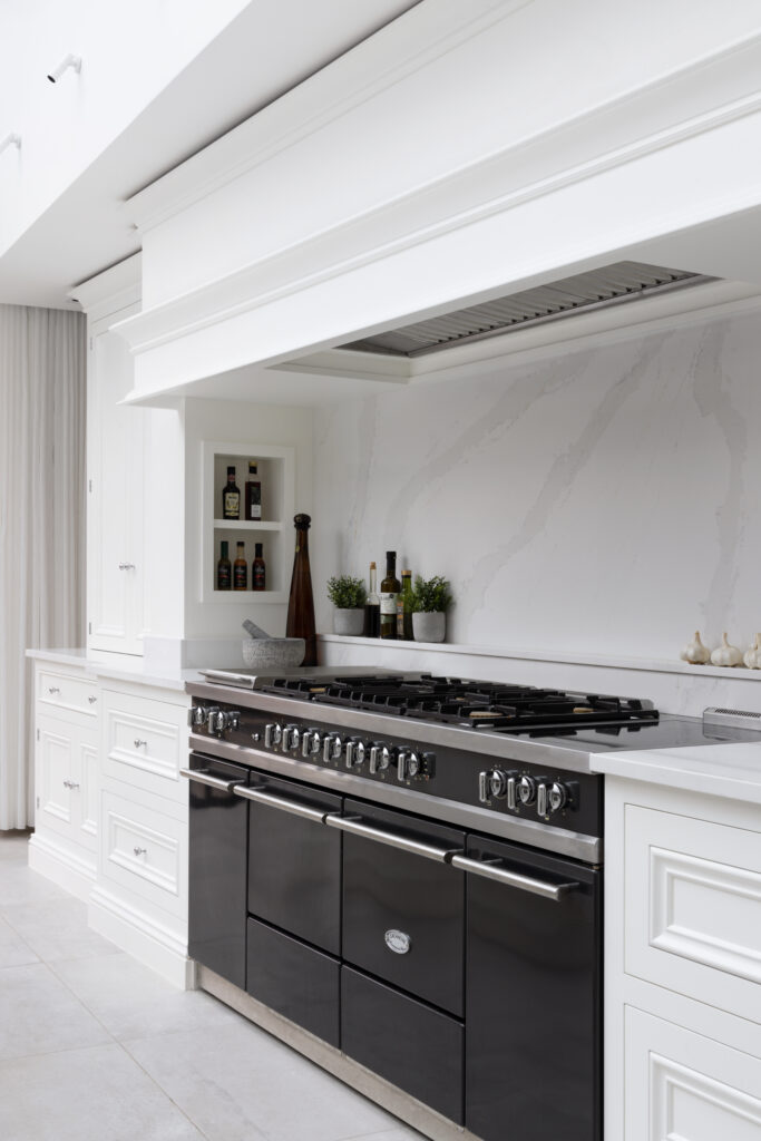
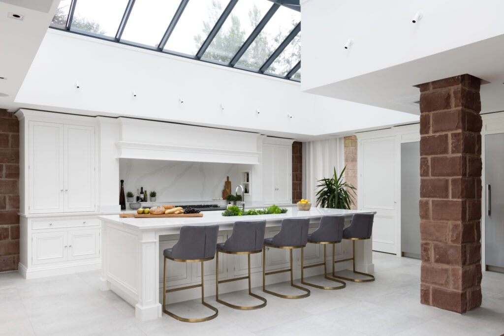
Instead of plastering over the past, we framed it. That incredible exposed sandstone wall became the anchor for the whole design. We placed the 1500mm Lacanche range centrally against it, allowing the crisp, painted joinery to contrast with the rough, historic stone. It instantly warms up the room and stops the space from feeling too “new.”
We didn’t stop at the kitchen. The joinery flows into the media snug, featuring a full wall of cabinets that mirrors the kitchen style – The whole ground floor feels like one cohesive space. By combining open shelving for the books and photos and deep closed cupboards to house the router, the remotes, and the clutter – it’s organised and stylish, but it also stops the big black screen from dominating the room.
We transformed an awkward transition space near the stone pillar into a curved reading nook. It doubles as a drop zone for keys and bags, proving that even the overlooked corners of a large home can be both beautiful and functional.
This project proves that sleek, modern design can live happily inside an old stone house. It is an expansive open-plan space that never compromises on comfort or character.
Schedule a free consultation with our team to begin your own home design project.
Over 300 pages of design inspiration